Kraina Relacji
A complete brand and digital product built from the ground up - including a high-converting e-commerce website, full packaging design for multiple product lines, brand guidelines, and social media creative.
web design
ux
E-commerce
responsive design
prototyping
cro
competetive analysis
packaging design
branding
social media
accessibility
View Live Site
where
Poland
what
A complete brand and digital product built from the ground up
Why
To help busy parents reconnect with their kids through fun, shared play
Role
UX Designer, Graphic Designer, Researcher
category
Children Products
When
Jan 2025 - ongoing

WHO was it for?
additional info
Please note: the illustrations used across Kraina Relacji's products and packaging were not created by me. My (and the team's) role was to take existing illustrations and use them as a foundation to build cohesive product designs — including packaging, brand guidelines, website visuals, and marketing materials.
problem statetement
Modern parents are overwhelmed. Work, responsibilities, the endless to-do list - quality time with their kids often falls to the bottom of the pile. They want to be present. They just don't know how to make it easy.
Kraina Relacji exists to solve exactly that. But being a brand new product in a market full of established names meant we had one core design challenge: how do you make someone trust and buy something they've never heard of?
we needed a design that:
01
Communicated the emotional value of the product, not just its features
02
Made the parent feel seen and understood - "we know how hard it is to balance work and quality time with your child"
03
Built trust at every single touchpoint
04
Made the buying process so simple and enjoyable that nothing got in the way of a purchase

introduction
We analyzed five direct competitors: Dinozabawki, Memogames, Kapitan Nauka, Karty Grabowskiego, and Mudpuppy.
The pattern was clear. Almost all of them had the same problems:
The Bad:
01
Websites that felt cold, cluttered, and visually uninspiring — no warmth, no life
02
Poor trust signals — nothing that made a first-time visitor feel safe spending their money
03
Long, confusing checkout flows that created friction at the worst possible moment
04
No clear value communication — the products looked nice but didn't say anything meaningful
05
No conversion-focused thinking — pages that looked fine but didn't nudge users to actually buy
The Good:
01
Some had strong product photography
02
A few had decent category organization
summary
This analysis gave us a clear map of exactly where to be better. We didn't just want a prettier website — we wanted a website that sells.


who are we designing for?
Two personas drove every decision we made.
marta, 38, marketing manager
persona 01
"I get home at 7pm and my daughter looks at me like I've been away for a week. I want to give her real attention, not just sit next to her while scrolling my phone."
goals
Find a quick, meaningful activity she can do with her daughter after work. Something that doesn't require preparation or explanation.
frustrations
Feels guilty about not spending enough quality time. Doesn't trust random brands she's never heard of. Hates complicated checkout processes when she's shopping on her phone late at night.
tomek, 42, sales director
persona 02
"I travel for work a lot. When I'm home, I want those moments to actually count. A board game sounds great — but only if it's something we'll both actually enjoy."
goals
Find a premium product that feels worth the price. Something that creates genuine laughter and connection, not just another toy collecting dust.
frustrations
Skeptical of new brands. Wants to see social proof before committing. Finds most kids' game websites generic and unconvincing.


introduction
The goals for the visual identity:
01
Playful but trustworthy — colorful and fun, but not chaotic or cheap-looking
02
Warm and human — this brand is about human connection, so the design had to feel alive
03
Premium — the price point is above average, so the design had to justify it
solutions
What we landed on:
01
A rich, multi-color palette — playful and childlike, carefully coordinated to complement the physical packaging of each product line
02
Friendly, readable typography — approachable fonts that feel warm and trustworthy, not corporate
03
Kraina Relacji's logo features a hand signet, which we extended into the brand language. Throughout the website and materials, playful illustrated hands point at buttons, highlight key messages, and act as decorative elements. It's distinctive, human, and ownable.
04
Motion and interactivity — to keep modern users engaged, we made the website feel alive. Subtle animations and interactive elements maintain attention and give the brand energy.
results
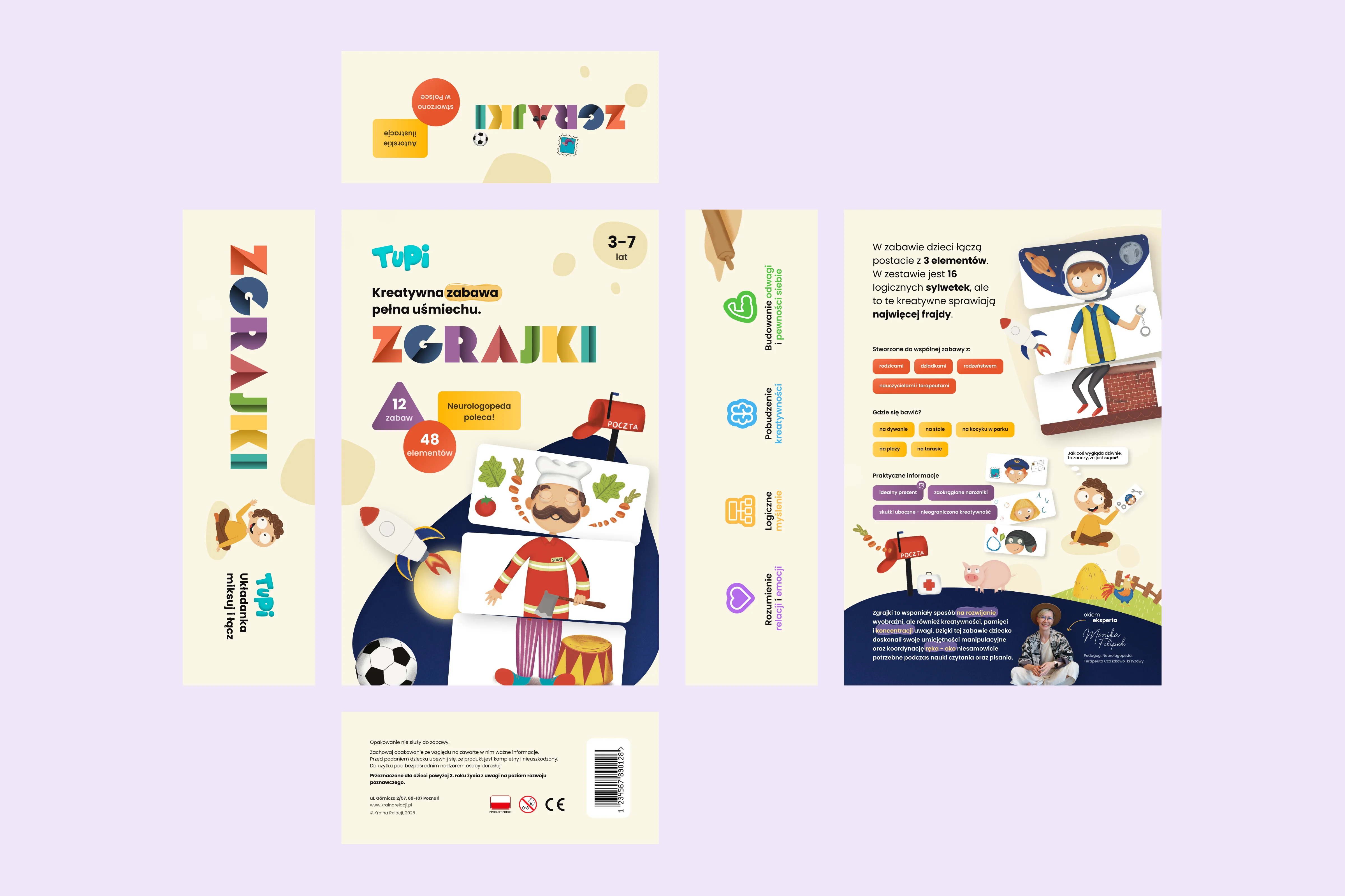
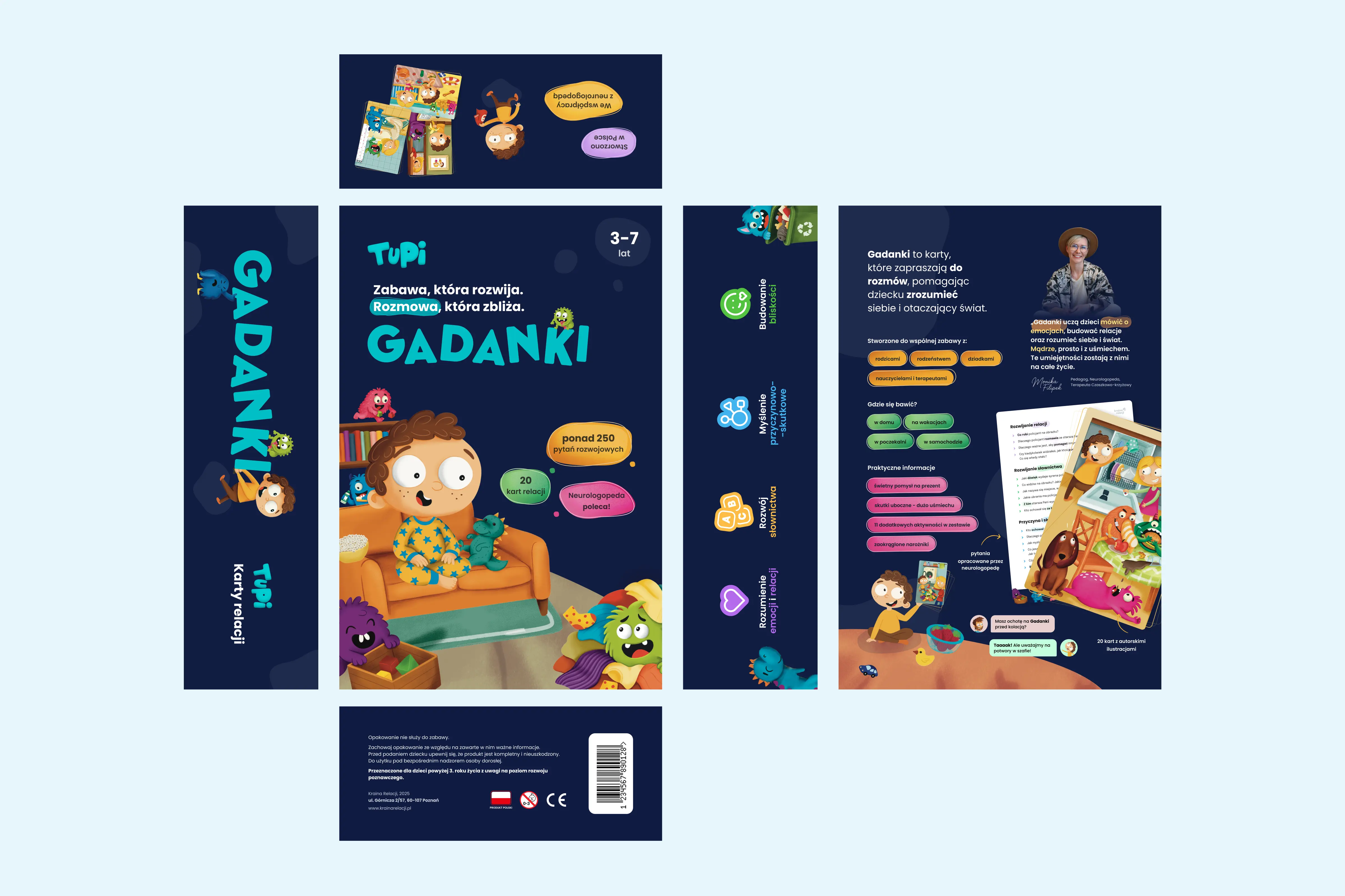
Each product line (Gadanki, Puzlaki, Zgrajki, Zamknij Otwórz Oczy) has its own brand guidelines — its own color story, typographic rules, and visual identity — while remaining cohesive within the Kraina Relacji family.


introduction
This is where the bulk of the design work lived.
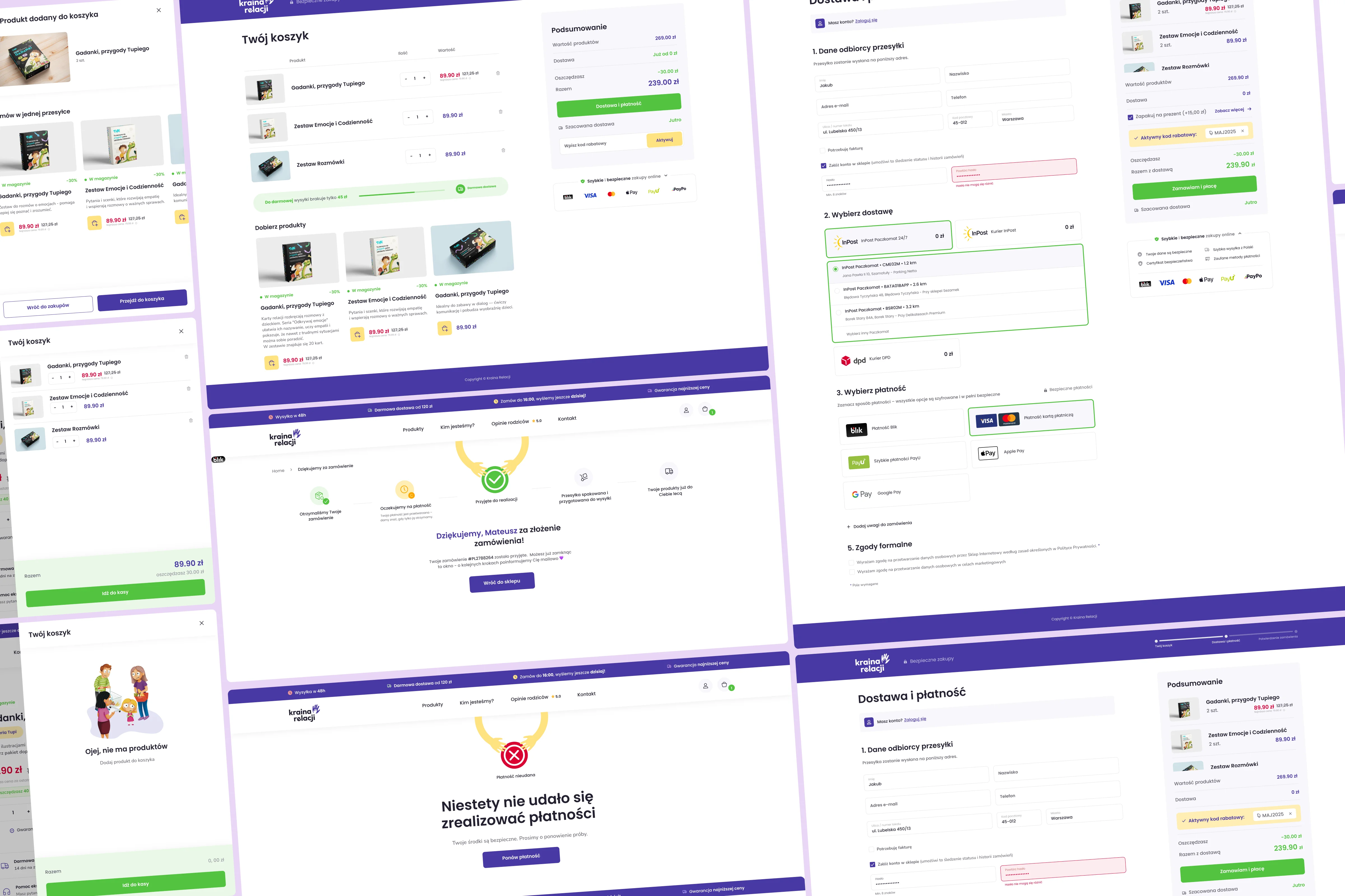
We built the website and store with conversion as a north star. Every section, every button, every piece of copy was placed with a purpose.
Key conversion and trust-building decisions we made:
01
Social proof placed strategically — real customer reviews from Allegro, Instagram, and other platforms are surfaced at the right moments in the user journey, not buried at the bottom
02
Clear, emotional value communication — the homepage doesn't just show the products, it speaks directly to the parent's emotional reality
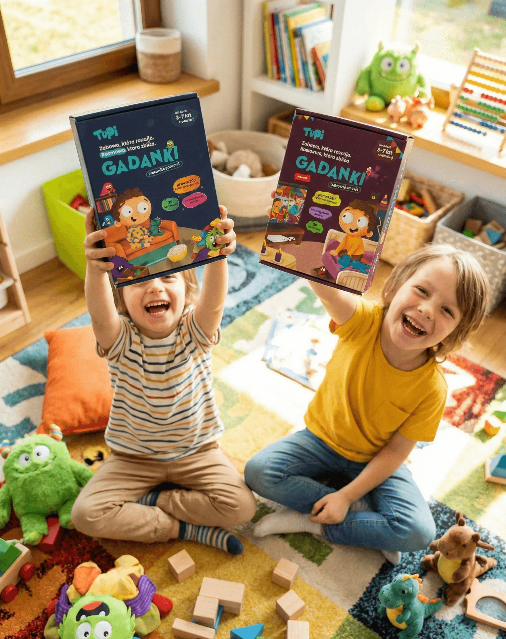
03
AI-generated lifestyle imagery — we used AI-generated visuals showing parents and children playing together (e.g., a mum playing Gadanki with her kids), making the experience feel real and relatable
04
AI-generated lifestyle imagery — we used AI-generated visuals showing parents and children playing together (e.g., a mum playing Gadanki with her kids), making the experience feel real and relatable
05
Sidebar cart with upselling — instead of a traditional cart page, we implemented a slide-in sidebar cart that appears when a product is added. This keeps the user on the page and surfaces relevant complementary products, increasing average order value
06
Fully responsive design — we designed desktop and mobile separately, ensuring the experience is smooth and trustworthy on every device
07
WCAG compliant — the entire website meets WCAG accessibility standards


introduction
The physical products needed to feel as premium as the digital experience.
We designed packaging for every product line — starting from drafts in Figma, then preparing print-ready files in Adobe Illustrator. Each box had to:
01
Communicate the product's personality and target age group at a glance
02
Feel premium on a shelf or as a gift
03
Stay visually consistent with the digital brand
results
The packaging design went through multiple rounds of iteration. Seeing the brand come to life as a physical object — something a parent picks up in their hands and gives to their child — was one of the most rewarding parts of the project.

introduction
We ran usability tests focused on one key question: would a first-time visitor, knowing nothing about Kraina Relacji, feel confident enough to make a purchase?
We tested with external participants — people who had no prior knowledge of the brand — and observed where they hesitated, where they got confused, and where they dropped off.
What we found and what we changed:
01
The checkout was too long. Users felt like there were too many steps between "I want this" and "I bought it." We simplified and shortened the flow, removing unnecessary screens and consolidating form fields.
02
The traditional cart page broke the shopping momentum. After adding a product, users were taken to a separate cart page — and many didn't come back. We replaced this with a slide-in sidebar cart that keeps the user on the product page, shows their cart contents, and surfaces upsell suggestions. This was one of our most impactful iterations.
03
Mobile buttons were too small. During prototype testing on mobile in Figma, we identified that several interactive elements — including key CTA buttons — didn't meet the recommended 44x44pt touch target size. We enlarged them and retested.
description
We built the entire website to WCAG standards — but it wasn't always perfect on the first try.
During the design process, we caught instances where button colors and text combinations failed AA contrast ratio requirements. We corrected these systematically — adjusting colors where needed to pass the standard — without compromising the visual identity.

introduction
Design didn't stop at the website. We also created:
01
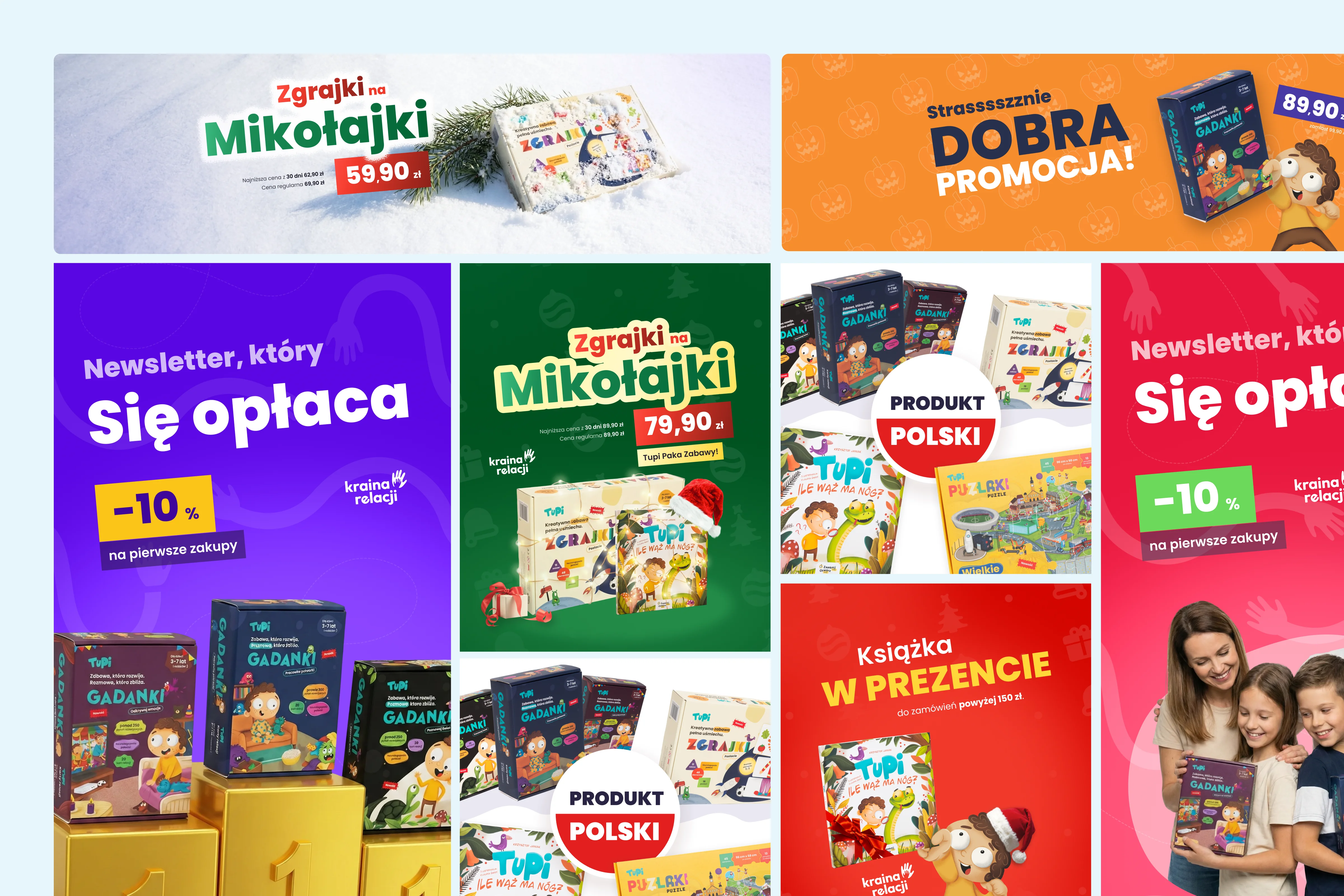
Sales banners for platforms like Allegro and Empik
02
Platform-specific graphics sized and optimized for each channel
03
Video ads — including Reels-format content — using modern production approaches

description
This project taught me a lot about what design actually does in a business context. It's not about making things pretty — it's about making people feel something and then making it easy for them to act on that feeling.
Working on a brand from zero, across every touchpoint — digital, physical, social — gave me a deep appreciation for how consistency builds trust. When the website, the box, and the Instagram post all feel like they come from the same place, users feel safe. That feeling of safety is what turns a visitor into a buyer.
I'm also proud of how seriously we took conversion optimization. A lot of designers treat the "selling" part of design as someone else's problem. We owned it — and I think that makes this project stand out.
View more of my work
Discover


